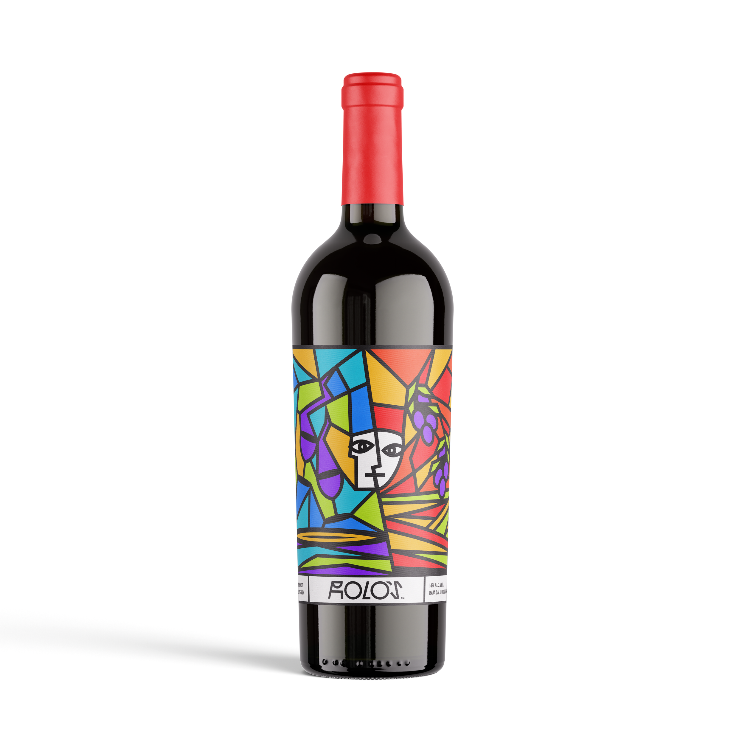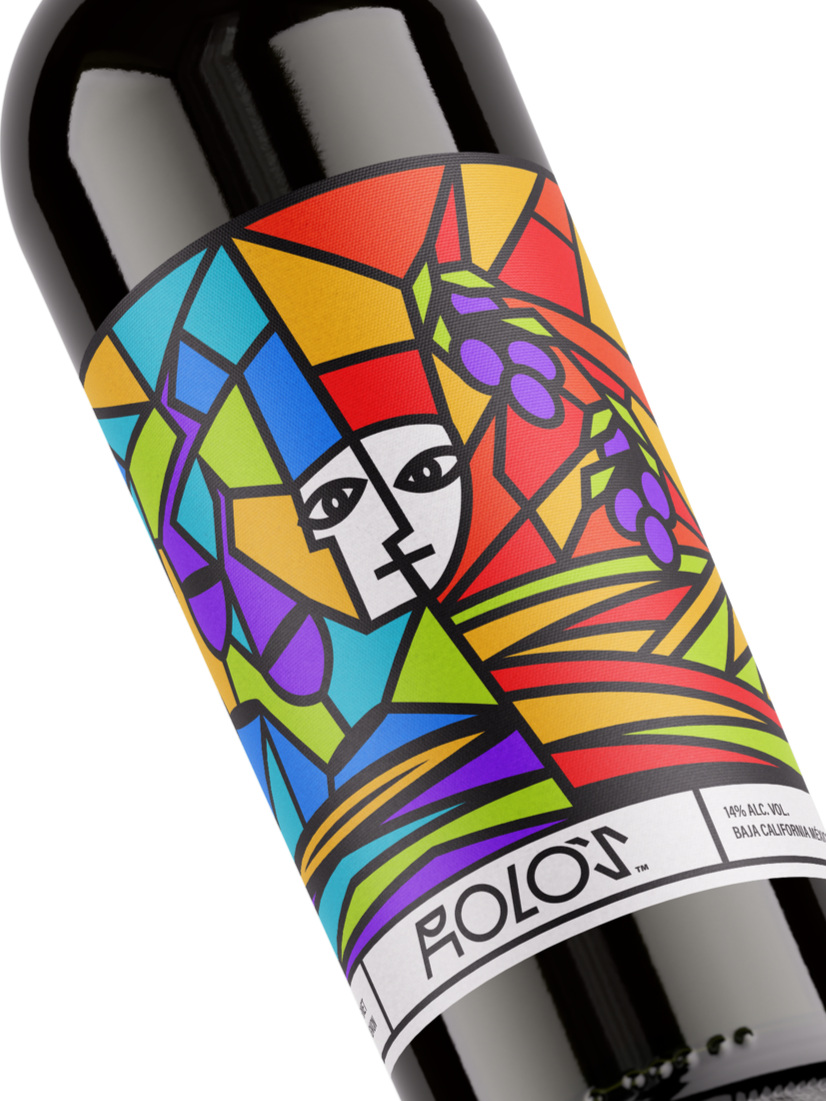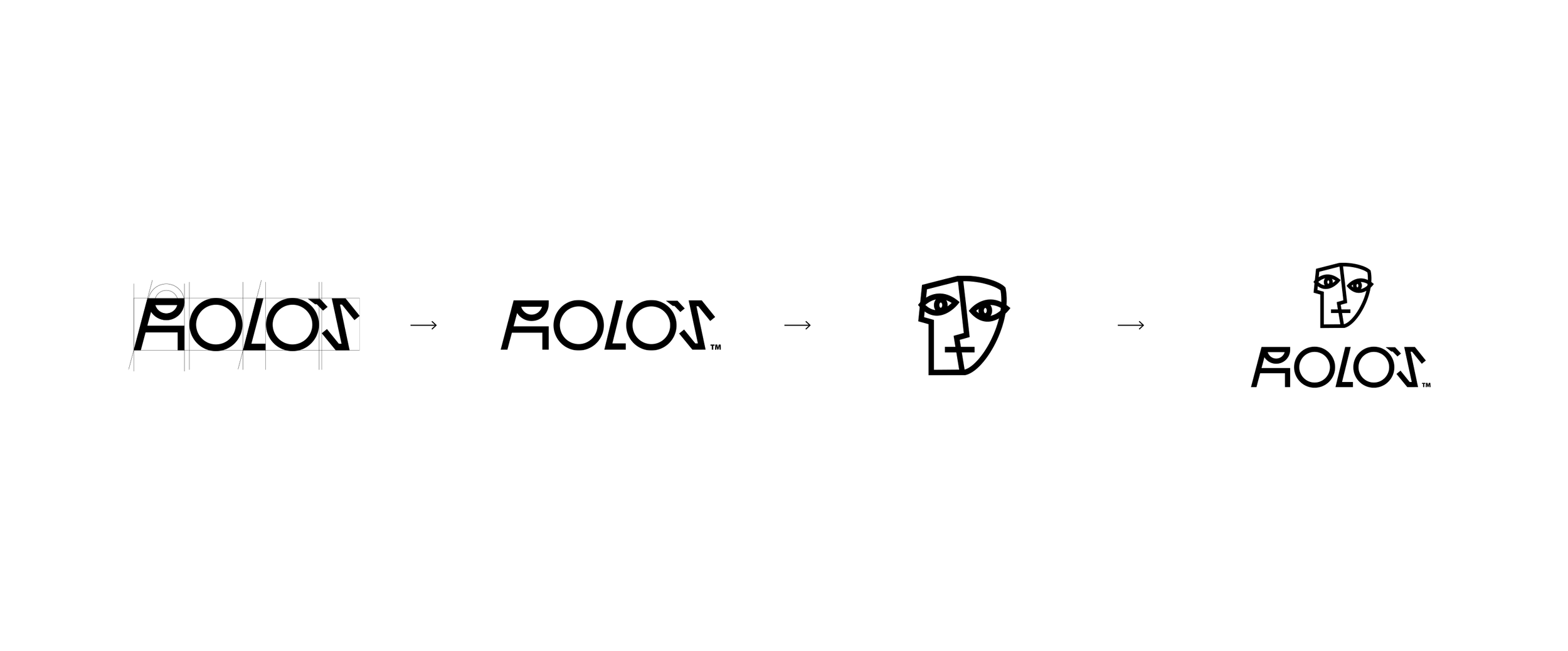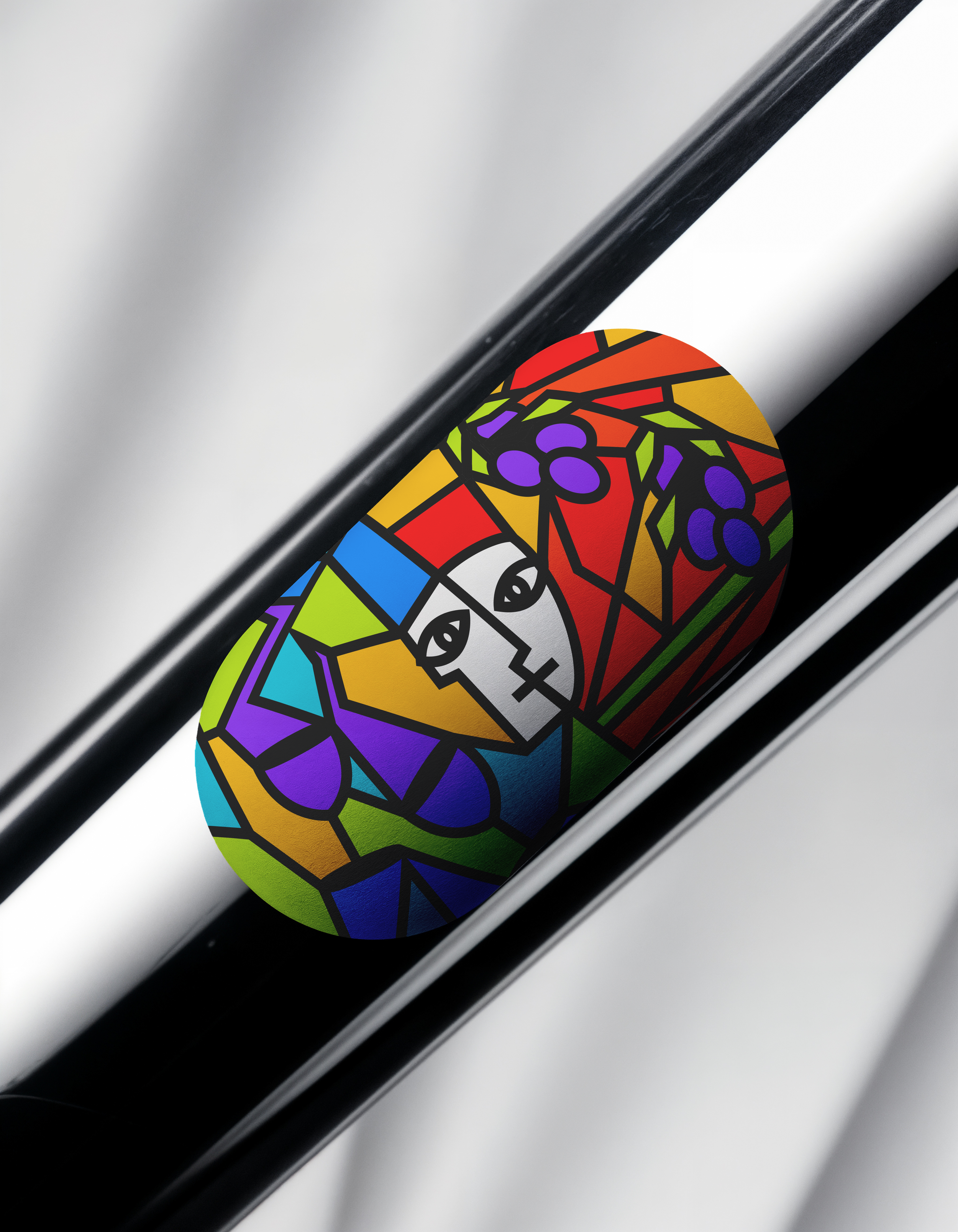
Vino Tinto Rolo’s
Was born from a cubist-inspired vision that reflects the partnership behind the brand. Created by two founders with distinct personalities, perspectives, and strengths, the identity embraces contrast as its defining element.
The logo and label design draw from Cubism’s fragmented forms and layered compositions, symbolizing two individual characters coming together to create a single, balanced expression. Geometric shapes, intersecting elements, and structured details represent the harmony between different viewpoints, much like the art movement that inspired it.